WEBSITE REDESIGN GUIDE FOR MANUFACTURERS
Introduction
Redesigning your manufacturing website is an exciting opportunity to reevaluate your marketing goals, improve your online presence, and enhance your site as a lead and sales attraction engine. As the web continues to evolve, the ‘rules of engagement’ of search engine optimization, digital marketing, and mobile-friendliness change with it. A website can be the single biggest marketing investment many companies make, and it’s essential to put the right foundation in place for success.
Even if you aren’t currently planning your company’s next website redesign, there’s no time like the present to evaluate what’s working and where there’s room for improvement. A successful manufacturing website should serve as the central hub for your marketing and sales teams, seamlessly drawing connections between the work done by people throughout your organization. This guide can help you diagnose those connections and identify opportunities for optimization that you can achieve right now, while also helping you develop a list of features to build and conversion targets to hit so that you’re ready with a plan when your next redesign cycle comes around.
Most manufacturers are aligning and automating their production processes through integration with back office ERP systems for inventory, production tracking and more. Forward-looking manufacturers are also building tightly-integrated marketing and sales-focused teams that use digital infrastructure to align everything from their web presence, lead collection and the CRM and sales-automation platforms. These teams are able to leverage marketing content as part of target account work and see how prospects have interacted with digital assets on the website and beyond.
Our experience has shown that most manufacturing companies refresh their web presence every three years or so (some other industries do so even more frequently). Kula Partners has consulted on, designed, and developed hundreds of high-performing websites. We’ve also conducted numerous mid-cycle refreshes for clients that might include adapting a site to be responsive, implementing CTAs and a refresh on a homepage, or a series of freshly revamped landing pages.
This guide provides all the information you need to conduct a successful modern manufacturing website redesign. The majority of the information will also be applicable to new industrial businesses creating their first site. We’ll look at Content Management Systems (CMS), the importance of mobile, and getting the most out of your content. We’ll also go over how to use conversion rate optimization and something called Growth Driven Design to ‘evergreen’ your website and allow your investment to continue to grow in performance over time.
If you have any questions while reading this guide, you can always contact us directly at Kula. We’d be happy to provide clarification for you.
Expecting a PDF?
We created this eBook as a web page for better mobile optimization, accessibility, & maintenance. Remember, you can bookmark this page for future reading, save it to the reading list on your mobile device, or print a hard copy. If you'd still like a PDF version of this eBook, you can download it here:
 Print This Page
Table of Contents
The Process
There are nearly as many processes for building a website as there are companies that build websites. As big fans of iteration, we’ve tried numerous different methodologies. We currently use a process that follows the Agile Scrum methodology, with principles of Conversion Rate Optimization (CRO) fully integrated into our execution. The industry calls this methodology Growth Driven Design, and we think it’s an excellent way to build a website that can constantly improve from a search rank and conversion standpoint.
At its core, a website is made of two things: software and content. The software is the web server, content management system, and custom functionality that runs on it, complete with front end HTML for semantic structural markup combined with CSS for styling of all elements. Content flows into this system in the form of text, images, audio, video and interactive content (which is, again, powered by software). Unlike other marketing activities, a company’s website requires at least as much development and engineering as it does creative and marketing talent.
Website Project Management
No one understands complex project management quite like manufacturers. The act of bringing physical goods to market is among the most complicated business processes to undertake. In many ways, bringing a new website to life is similar to manufacturing: it has many moving parts, and requires frequent (and occasionally constant) communication between you and your agency. Raw materials such as copy, photography, and video need to be sourced and appropriately categorized. The design process to create an intuitive site is no different than what a manufacturing company’s talented engineers and product designers go through.
In the end, good project management is largely a function of setting up channels for good communication, both inside the client corporation and the agency and between these two parties. To avoid ending up in email hell (‘I swear I sent that content approval last week, now where’s the email?!’), it’s best to have a central location for all site discussions as well as file and content sharing. Tools like Basecamp, Trello, and others all do a good job at this—all that matters is that you have this kind of space available and that both parties use it religiously to share updates and feedback.
Any web or marketing build project should start with two things. The first is a full suite of Buyer Personas so that you know who you’re building for. The other is a technical and content architecture. We’ll get into these two components in the next couple of sections, but let’s spend a few moments looking at the web development process Kula has adopted after more than a decade of experience.
Agile Web Development
As an agile development firm, we create what are called User Stories. User Stories are descriptions of every discrete piece of functionality in the entire site, which are planned from the perspective of the users of the site. Associated with each of the these functional components is an estimate of value in Story Points (units of complexity, similar to but different from the billable hour since they are associated with the complexity of achieving the required outcome, not the time required to complete the task). This way, our clients always know what they’ll pay for the deliverable—not how much time it will take a developer to complete the task. Lastly, each story also contains a Definition of Done. In conjunction with the wireframes and other early components of the build, it makes it very easy to understand what the finished product will be before it’s ever built.
The core idea behind Agile (the methodology is most often associated with software development) is that because each component of the build is well-detailed in a User Story, it can therefore be built without having to wait for another piece of the project to be completed. This differs from a more Waterfall-style project management approach (think of Gantt charts and processes that require each piece of a project to be finished before the next can be started). Many manufacturing companies will be familiar with (and active users of) Waterfall project management but some may have implemented the Kanban variant of Agile, a PM methodology that was initially developed by Toyota in the 1940s and 50s.
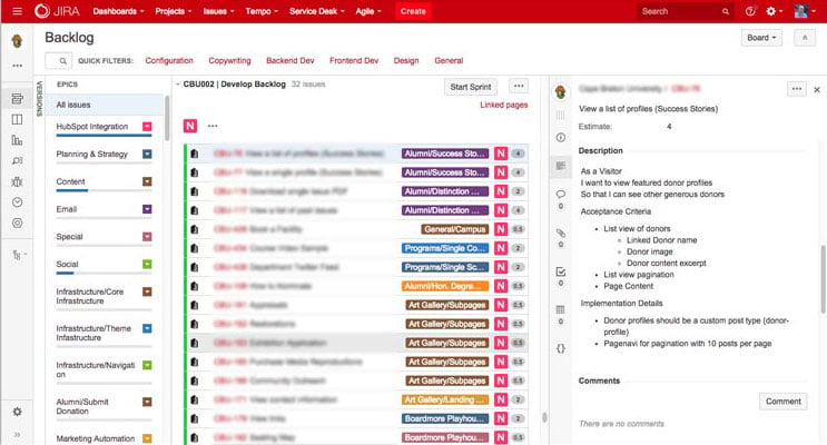 This screenshot from Jira, an Agile project management system, shows an example of how a straightforward User Story could be written
User Stories & Growth Driven Design
The goal with these initial User Stories is to ensure that the first phase of the site build can be stood up as quickly as possible, allowing for early feedback and continuous, ongoing improvement from CRO. The trouble with many web builds is that they can take months or even years to complete. This makes it incredibly difficult to take into account emerging web trends or material learned from watching actual visitors on your site and how they interact. By getting started quickly with a minimum viable website that continues to grow and improve, your lead generation and sales results will improve week over week and month over month.
The process detailed above aligns tightly with the Growth Driven Design system and is based on the agile project management framework. Within Agile and Scrum, agencies can rapidly and concurrently work on different components of a site’s structure, allowing for cross-functional implementation. Project components like a content audit, information architecture, and wireframes can all happen concurrently, and the skills of each of team member can be brought to bear very early in the process.
Once the early planning components of the site build are complete and approved by the client, it’s time to move into the next phase of development. This includes front and back end development, content editing and writing, and deployment of the site to your hosting environment. It also includes CRO and ongoing inbound work to drive and convert top of funnel traffic. We’ll look at all of these elements in the coming sections of this guide—and much more.
Building for the Right Audience
To ensure that you’re building your site for the right audience, there are two main things you need to do before you get started: Buyer Persona development and analytics research.
With the latter, make sure you spend time in your analytics package—whether that’s Google Analytics, a tool like HubSpot, or heatmaps from Hotjar or other tools—and find out the following:
- The most popular content pages on the site in the past year.
- The percentage of users on mobile devices. (ie: is it just a growing segment of your users, or is it the majority?)
- Where is your traffic coming from? If you provide geographically-limited services, is there a significantly large portion of your site visitors arriving from areas you can’t possibly serve? If so, a content strategy to grow reach within your boundaries may be worthwhile.
- If you are already doing digital marketing, what assets are producing the most leads?
- If using heat maps, where do people succeed in finding the content they’re looking for and where do they fail?
Diving into your analytics to better understand past successes and challenges ensures that your new build will be better, and will be more suited to the people who visit your site.
Buyer Personas
Buyer personas are often developed in conjunction with the sales and marketing team of your organization and are are a construct that defines your ideal buyer(s) based on a number of elements.
- Start with the main reason that each persona has for seeking out your organization. For example, a company that manufactures small electric motors with applications in automotive, healthcare technology, and university research will have at least one persona for each customer group. Each has a different reason for visiting your site, and your content will need to be tailored appropriately.
- Include demographic and psychographic data for each persona. This isn’t the most important part of the persona, but we find it helps to be able to put a ‘face’ to the persona.
- Are there any unique identifying traits? For example, are they good planners or poorly organized?
- What is their timeline for meeting their goals and do they have specific responsibilities?
- What challenges are preventing them from completing their goals?
- Of major importance to digital marketers, what are the marketing triggers that cause them to look for your product or service?
- Who or what influences each persona?
- What are the objections or questions your personas need answered? Although many sales teams will focus on objections related to price, a good digital marketing agency will be able to press deeper and get to the root of these concerns.
- Lastly, describe how your organization helps solve for your personas. What is it you do that addresses their objections, helps them succeed despite their challenges and ensures that the buyer finds the right solution? Assuming that the buyer is the right fit, how do you convince them of this fact?
Your agency will work with you in this research and persona development phase to create the first part of a strong foundation for your new website. Once the agency knows how visitors and customers have used your site in the past and gain a better understanding of who your optimal Buyer Personas are, it’s much easier to create a platform for a site that converts visitors into leads, leads into customers, and customers into ambassadors for your business.
Get the B2B Buyer Persona Template
Ready to start creating your Buyer Personas? This template will guide you step by step in defining your ideal customers so you can reach and serve them more effectively. Get the B2B Buyer Persona Template now:

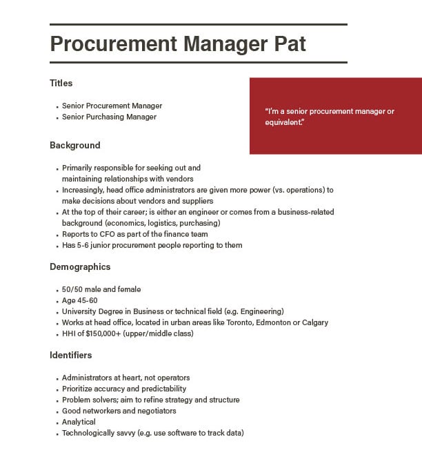 A working Buyer Persona document, featuring their Background, Demographics, Identifiers and more
A Successful Build Requires the Right Foundation
Following the construction analogy, websites require a properly-designed foundation before the more visible components of the site can be built.
We think it’s necessary to build a number of different components required for the development of the site before getting deep into code, content, or design. Fully understanding the base elements of the site—as well as the required functionality before starting the actual development—means that the right things get written, designed, and built. In addition to the Buyer Personas, our team also completes the following when embarking on any website redesign:
- Information Architecture
- Interactive Wireframes
- Content Audit
- Homepage Mockup
- User Stories
- Digital Marketing Strategy
Information Architecture
The information architecture of the site is a tree diagram of all content and where it will reside on the new site. In a Growth Driven Design scenario, it’s important to repurpose as much of the previous content as possible to quickly get a new site up and running. When developing this document, our focus is on the existing content that will be ported to the new site, as well as an overall industry review to see what your competitors are doing. Other content structure considerations include elements that come from the Content Audit including keyword research, persona-focused content such as campaign landing pages, and calls to action. It’s also very important to ensure that the sitemap allows for future growth, so keep the heading titles as keyword-focused as possible while also permitting for additional subsections down the road.
One thing we’ve noticed over the last number of years is that, as sites get bigger and more complex, it’s getting harder and harder to keep the total number of website sections under seven. Seven is something of a magic number in interface design, and corresponds with the maximum number of items the typical human brain can remember in a row. This is why the main part of phone numbers in North America are only seven digits, for example. If your list of nav items is too long, you risk your users forgetting about the first few items after they’ve read the tenth.
Generally speaking, if your navigation exceeds seven items, look for opportunities to group like with like. For example, sometimes grouping your About, Contact, and Company sections allows you to free up a few navigation ‘slots’ that can be better used for more product- or service-focused content. This way, the eye of the site visitor can see the distinct groupings. It’s important to develop the architecture before moving into more interactive deliverables such as wireframes or mockups.
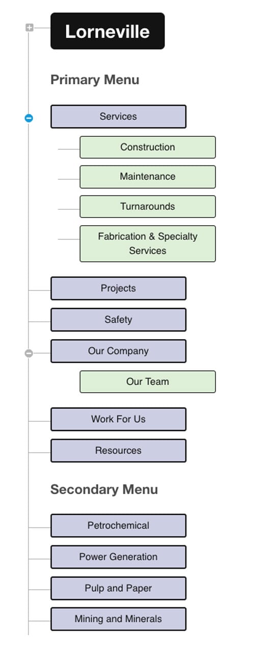 The information architecture (IA) presented vertically
Wireframes
Wireframes are an integral part of the planning process for creating any digital interface. The goal with wireframes is to remove the design layer, simply showing the hierarchy of content on the page. The elements of the interface are all in place, allowing clients and designers to see how things might work. Generally, wireframes have no colour. They use placeholder text and no imagery to ensure that no one gets hung up on elements of taste instead of focusing on how a user might move through the site. A wireframe created entirely as lines and boxes may not maintain a high degree of fidelity to the final design, but it should still nod in the direction of where the design will be headed.
There are a number of different ways to create wireframes. Traditionally, a design team would determine the key pages required for a site and create one static wireframe for each page in a page layout tool. As tools such as Balsamiq have become available, it’s gotten easier and easier for anyone to map out an interface and get a basic sense of how a site will function. It’s also possible to create wireframes for every page in a site, but unless the content and interface are changing significantly on each, the investment may not be worth it.
 Interactive wireframes which show image placement, navigation, featured news posts and more
Content Audit
In conjunction with the information architecture and wireframe deliverables, a content audit helps unearth what content already exists and what net new items will be required. If you’ve been through the website redesign process in the past, some content may be dated, disjointed, or require edits to fit into a new context. If your content is very old, it may have been created back when everyone followed the trend of reducing site copy to an absolute minimum—meaning that to meet modern SEO standards it will need to be expanded.
The content audit can use the Information Architecture as a base. Content from the old site should be assigned to its new home within the redesigned sitemap. If nothing exists for a content section, it will need to be created. Some content may simply require an edit or polish for tone. This should be noted in the audit document as well.
In following the Growth Driven Design methodology, the priority should be to reuse as much of your previous content as possible in order to expedite the site build process. Content that has been live on your site for three years may not sound exactly as you would like, but as long as you commit to adjusting that content based on analytics after the site launches, you can put off the full rewrite and save a big chunk of time early on.
Other elements of a content audit include:
- Keywords each page should be targeting
- The offer or call to action on that page
- Meta titles and descriptions for each page
- The URL of the existing page so that it can be appropriately redirected if necessary
With these elements in place, you’ll be well equipped to choose which content requires a rework and what can wait in order to get the site live as quickly as possible. Check out the full section on content for more information on content strategies.
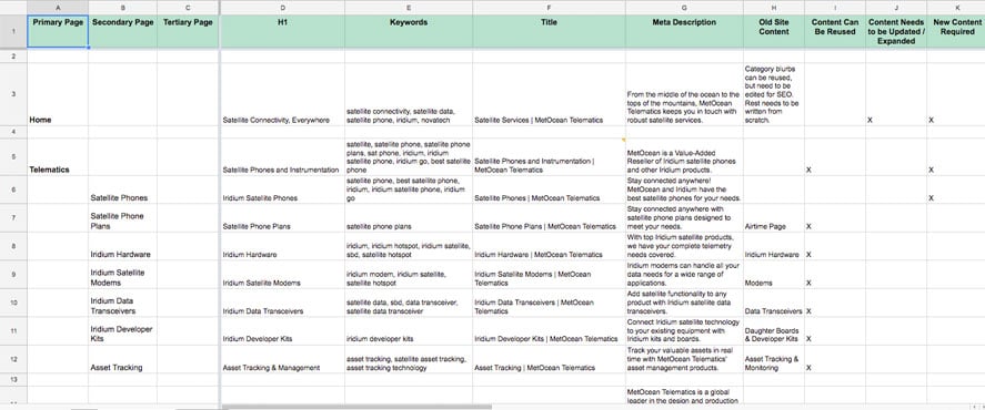 Example of a draft Content Audit, indicating content status, keywords, and more
Homepage Mockup
In the early stages of a website redesign project, it can be difficult to determine the design parameters for the new site. Communicating the visual tone and style is also a challenge. In the past, we’ve used mood boards; a collection of imagery, typography, and texture to show varying elements and how they interact together. That can be cumbersome to understand and, in our experience, most clients would prefer to see something more in situ and less esoteric than a moodboard.
So, how do you help the design team working on your new website to translate your brand vision into a new interface you and your clients will love? To start, if you have current brand guidelines, they should be provided to the agency. Include current logo files, Pantone or hexadecimal value colours, and typography. If your company has a bank of available high quality photography or illustrations they should be provided, too.
If there are sites you like (or hate), provide a list of URLs to the design team. It can also be very useful to review the sites of close competitors to spot trends and commonalities. In conjunction with the aforementioned brand standards, this research allows the agency to develop a proper understanding of the visual parameters for the new site.
We have found that delivering a homepage mockup (without internal pages) as part of the early Foundation Phase of the project allows us to ensure that we are on the same stylistic page as our clients. Internal page layouts will be based upon this mockup and the wireframes that detail all of the other page types within the site. Seeing how the site will come to life early in the process is a great way to establish the overall tone.
User Stories
User Stories are an important component of an agile project management process. In order to accurately estimate the build of a website, Kula creates a User Story for every aspect of every piece of functionality in the site. Each User Story has an estimate in Story Points—a unit of effort that aligns with the value of the deliverable, not the hours required to create it. This ensures that our clients do not pay based on the time it takes to complete a project, but instead based on the value it delivers.
Every User Story is composed of four parts:
- Who the story is for (general audience, a specific persona, or even internal users).
- A description of the functionality and how it will work, referencing the wireframes, content, or strategy.
- The definition of ‘done’, such as the required form fields, content assets, and other technical necessities.
- The total number of story points required to complete the task.
Once the User Stories are complete, the total build budget will be known and can be planned for accordingly.
Digital Marketing Strategy
The final deliverable from Kula’s Foundation Phase is a Digital Marketing Strategy. The strategy is a living, breathing document that uses everything else that has been completed during the Foundation Phase to help determine the key tactics to drive traffic, convert leads, and turn them into customers.
Divided into 90 day epics, the strategy details the goals of the digital marketing and iteration plan along with the tactics which will be used to help achieve these goals. These might be tactics like content creation, new marketing automation funnels and offers, social media marketing, CRO, and more. The strategy also leaves room for iteration and adjustment based on the data and analytics we see from early results and tests.
The strategy also leans on the Buyer Personas to ensure that all content has a target. Generally speaking, the more specific you can get around a piece of content, the more likely that it will be able to answer the common questions of your buyer personas. Of course, the more granular the content becomes, the more it costs to produce and maintain.
The strategy’s role in a web build is to help ensure that everything that’s done in the build phase—from front end coding to on-page SEO to content writing—is focused on helping to drive and convert more leads and achieve the Key Performance Indicators that have been laid out in the strategy. Once the site is live, the digital marketing strategy sets the path for growth and ongoing iteration.
 Screenshot of a homepage mockup, offering an overview of the primary offerings, social proof, and several CTAs
Content
As intense and technical as your web build might be (especially if the site is heavy on ecommerce or other functionality), it’s easy to underestimate the amount of time and involvement required client-side to get content prepared for a new site launch. In our experience with large site builds, the content writing requirements can easily take more time than the actual programming and design.
The Content Audit as described earlier in this guide will provide you with an idea of all of the content that is required to flesh out all of the site sections, and also give you a sense of the priority of each section. It can also give you a sense of the magnitude of effort required were you to write all new content, rewrite existing content that is incorrect, out-of-date, or irrelevant, and edit the remaining pages for tone.
What content can be reused?
To ensure that your new site is up and running as quickly as possible, try to reuse as much of the existing content as possible. As noted earlier, getting the new site live will allow you to use your analytics to understand what content needs a complete rewrite (and why). Reviewing your post-launch metrics in a tool like HubSpot will highlight which pages are ranking, and for what keyword terms. Using this data and highlights from visitor recordings, heatmaps, and clickmaps, you can focus on optimizing content and visitor flow through the site so that no effort is wasted.
While editing a page for tone may only require an hour or so, researching and writing content from scratch can easily take the better part of a day for a single long-form page. Current search best practices tell us that search engines prefer longer, more in-depth content, as this is an indication of breadth of understanding of the subject. Of course, the content actually needs to be good for people to read it. You can’t simply stuff a page full of words just to round out the word count. When you consider that most sites for medium-sized businesses easily contain dozens if not hundreds of pages (not counting blog posts, landing pages, and other inbound-focused content), it’s easy to see that a fresh rewrite could take literally hundreds and hundreds of hours to write, rewrite, edit, and publish.
Combine that effort with the technical nature of the content many manufacturers require and you have a recipe for content that will take forever to complete. This is why prioritizing content and focusing on the pieces that will generate results quickly is an essential strategy as part of a website redesign. In our experience, trying to write or rewrite all of the content can dramatically delay the launch of the site, meaning fewer leads, less traffic growth, and a missed opportunity to set a baseline in your analytics from which to grow.
Non-written content
Of course, content goes beyond the written word on a web page. There’s also:
- Photography
- Illustration
- Iconography
- Infographics
- Video and audio
- Downloadable eBooks
- Interactive content such as ROI calculators
- Autoresponder emails, thank you messages, and marketing funnels
Product images and videos are almost always created custom for most manufacturers since the creator of a product should also be the manager of all things brand and imagery related. It’s not uncommon for there to be a requirement to create new, better, or more consistent product image assets. Talk to your agency about finding a photographer or videographer to craft these new images, and use the art direction talent at the agency to tie it all together. If you frequently introduce new products, have a system available to easily replicate the look and feel of the previous product shots.
Many companies rely on stock imagery to fill out key areas of the site. If you don’t already own a bank of images that accurately fit your brand, you’ll absolutely need to purchase new images or hire a professional photographer to capture what’s required.
Before the advent of inexpensive stock photos, it was de rigeur to use a photographer to shoot everything that was needed. This could include images for the homepage and main section pages that capture the feeling you’re looking for, as well as key product images, staff photos, and more. Working with your agency, compile a shot list to see what you have already and what will be needed. Do the shots you already have on hand fit the bill from a quality perspective? Are the files large enough with sufficient resolution to blow them up as needed? Can the images be understood at small sizes on mobile devices? Do you have the necessary rights to use the images?
The other consideration with stock photos is that in almost every case, the same image will show up on many other sites—including, potentially, your competitors’ sites. This is obviously why custom photos, illustrations, and icons are appealing. They may be more expensive, but they’re all yours.
Other more interactive and engaging content types such as video, audio podcasts, downloadable infographics, or interactive calculators can be planned out as conversion assets for launch or after the site is live. As part of your digital marketing strategy, your agency should be able to work with you to plan what special assets are required for launch for top of funnel and mid funnel conversion, and what can be created after the site is live.
 A sample from a custom icon set developed for a website redesign
Interface Design
The interface of a site is what you see when you arrive at a particular URL and the site renders in your web browser. It’s the combination of content, navigation, imagery, typography, interactive features, buttons, forms, and more that make up the visual experience. If we think back to the ‘bad old days’ of the web, most websites were atrocious from a usability and visual design perspective. The coding of web pages was still largely the domain of your neighbour’s cousin working tirelessly in the basement, fueled by Red Bull and questionable taste. However, in 2017, nearly anyone can pull off a decent (if generic) web presence using free or nearly free WordPress themes and templates. It won’t be ‘yours’, but it will at least be functional.
Since you’re reading this guide, it can be assumed that you’ve moved beyond free or cheap templates. So, what do you need to consider when approaching a full site redesign? Back in the Foundation Phase section of this guide, we covered the things you should plan to provide to your agency to help them get a better understanding of your brand, visual assets, likes, and dislikes. Once the team has these assets, they can begin to understand your unique brand and the interface required to bring it to life online.
The Designer’s Process
When it comes to creating the actual layout for a site design, there are numerous ways to go about it, depending on the experience and techniques employed by the specific designer. Most designers still start by sketching mockups on paper with a pencil and then transition into a digital mockup. Many designers of a certain vintage use a tool like Photoshop for creating static mockups, while others have begun to experiment with software that didn’t originate for print design such as Sketch.
Another school of thought is to design ‘in the browser’ using code. This can allow for faster iteration of concepts and ideas and the ability to see interactivity earlier, although an experienced Photoshop user should be able to test ideas quickly as well. It also permits the designer to move quickly between mobile, tablet and desktop layouts, testing each as they go. Kula uses a combination of these techniques, opting to design the homepage statically and then create the rest of the site layouts in code, based on that ‘model’ page in conjunction with the interactive wireframes.
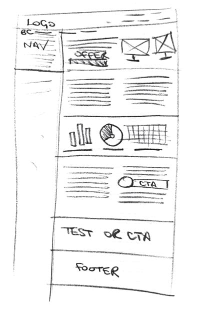 A sketch of a homepage, created to guide the design of the wireframes and mockups
The Importance of Mobile
Depending on your audience, mobile may be a huge consideration—or it may simply be a portion of your audience that you can’t ignore. In the past five years, we’ve seen mobile (and tablet) web use in the case of some sites go from single digit percentages to well over 70% of total site traffic. According to our analytics for hundreds of websites, most businesses see 20-25% of their traffic from mobile devices. For some organizations, mobile is so important that we’ll start the design process with the mobile layout first, knowing that this is how many users of the site will opt to experience it.
There are numerous considerations when designing for mobile. One is the context of the user. Mobile users could be visiting from just about anywhere. They could be at a coffee shop, sitting on the bus, or walking down the street (hopefully they’re still paying attention to traffic while browsing your site!). Generally speaking, mobile site pages should focus on getting the users to the content as quickly as possible without a whole lot of chrome in the way, since the screen real estate is so much more limited.
Many mobile interfaces also hide the navigation behind what’s colloquially known as a hamburger menu, represented by three lines that expand to a full menu when touched. Current research has shown that most users still don’t understand this construct, so adding the word ‘Menu’ to the button to describe what it is may be useful. The Nielsen Norman Group recently released a study showing that users were much less likely to use navigation designed to only appear once a hamburger button is clicked, so be cautious before you hide the navigation.
Within most analytics packages, tablets such as the iPad are often grouped into the mobile category. It’s important not to ignore this device. Modern tablets have nearly the same resolution as desktop and laptop screens, but site interaction is done via touch as opposed to a trackpad or mouse. Don’t forget that touch targets for links and navigation still need to be large enough that they are easy to tap. Touch interfaces also allow for additional interaction behaviours—allowing for gallery interfaces to be easily navigated via swipe, for example.
Even if the vast majority of your current site visitors are still using their laptops to explore your site, make sure your agency also creates a bespoke mobile and tablet interface. The best and easiest way to do this is via a site that is designed responsively. Google also penalizes sites that do not have a mobile variant by dropping the rankings in mobile search results, a change that will soon also apply to desktop sites. In 2016, there’s absolutely no reason to build a site that is not optimized for both mobile and desktop.
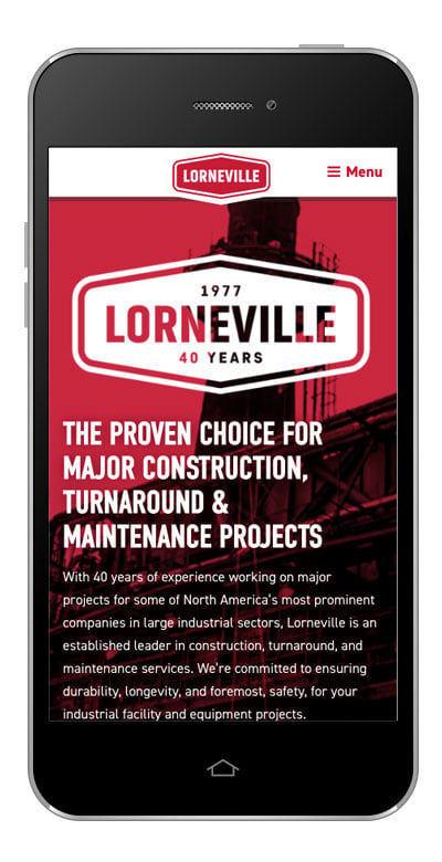 A mobile screenshot of a homepage, showcasing a smaller menu button and how an interactive tool is resized for a smaller screen
Responsive Design
As mobile devices came into popular use, the web design community began to struggle with the best way to develop websites for desktop and mobile devices. The main competing models included the development of a stripped down site with only absolutely necessary functionality and content, and Responsive Design, a system of using custom HTML and CSS for each main screen size and adapting to that size when the page loads, with the same content and functionality as a desktop site. While it’s possible to make a very fast stripped down mobile site, the functionality doesn’t always meet the needs of site visitors, requires the maintenance of multiple codebases and several versions of the site content. Often, these custom mobile sites employ a distinct URL structure as well, making it harder to share content between device types. Media sites are especially bad for this. Viewing a mobile interface on your desktop computer is a horrible experience, as is trying to read a desktop site on your iPhone.
By contrast, a responsive approach uses various resolution breakpoints to determine what device is viewing the site, and responds by scaling the interface to that device, ensuring that everyone sees content in the best format for their current context. Responsive content only needs to be entered or maintained in one place within your content management system, making these sites easier to manage than discrete desktop and mobile sites. It truly is the best way to build for the web, unless you are building a very specific mobile web application that needs to perform in a highly specialized way, more like a mobile app than a website used for marketing or ecommerce. That approach comes with significant additional cost as well.
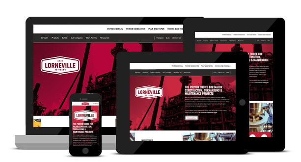 Examples of how the same responsive homepage renders on a variety of screen sizes
Homepage
For most companies, the homepage is their single most-visited site asset. As such, it needs to wear a number of hats, which makes it difficult to be optimized for absolutely everything. Think of your homepage as the jumping-off point designed to give your site visitors a taste of what you do, and then encouraging them to dive deeper into the site.
The homepage should succinctly describe your offering. For many companies with more than one core line of business, it can be hard to pick just one thing to showcase. This often results in what we call the ‘split entry house’, where the visitor has to choose to either go upstairs or downstairs upon entry—not an optimal situation. However, this is sometimes unavoidable, so you should simply try to direct users to their area of interest as quickly as possible without overwhelming them with choice.
Avoid using carousels of multiple images with a different offer on each at the top of the page. Our research has shown that only the very first slide has any actual interaction and the rest are ignored. Instead, use the ‘above the fold’ area to reinforce your core offering and serve up a relevant conversion asset CTA in this space. As the visitor moves down through the homepage, you can surface other secondary offerings and additional information about your organization. Don’t forget to surface social proof from current and former customers in the form of testimonials (or similar content). If your site offers products for sale via ecommerce, some of the most popular products could also appear.
Modern homepages are often long and in-depth affairs, and this is OK. In fact, in some conversion optimization tests, long pages have been shown to convert at many times the rate of more focused, shorter homepages. The old advice you’ve likely heard about people not scrolling are completely untrue (and generally always have been). Our heatmap testing has shown that people do scroll and, in fact, the people who are most interested and most likely to buy your offering definitely take the time to scroll and read your content. Provide both text and button-style links throughout the page, and use language that encourages your visitors to click and explore more. This will also help in lowering your bounce rate.
Lastly, don’t forget to optimize the footer of the homepage and all internal pages. Provide a second set of navigation links here, so that people who have made it all the way to the bottom can quickly jump off to a product or services page. You may also want to consider including your logo and a brief intro to the company in this space. If your organization has a physical presence, include your full street address here as it can help with local search optimization. You can also consider including a simple contact form or another type of CTA in the footer, such as a sign up form for your mailing list or blog subscription.
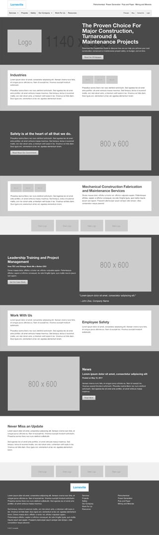
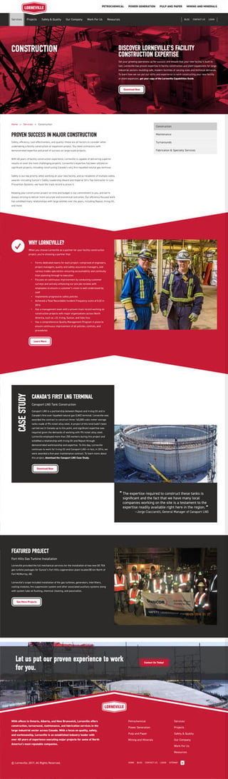
An example of a detailed, long-form homepage, featuring a video, the organization’s value proposition, social proof, resources, and more
Internal page layouts
Although the homepage of a site may be the face of your site, the internal pages are the backbone of your web presence. These can include section pages that lead users to the core information that they’re looking for, search results pages, or long-form product pages. As noted above, the problem with the homepage is that it needs to be a generalist whereas the internal pages by their very nature can be specialists. This is what searchers value most, and internal pages are most likely to rank for specific keywords.
Make each internal page about only one core idea or topic. Ensure that every one of these pages has an appropriate CTA which aligns with the content, if at all possible. If you sell products via ecommerce, consider including links to relevant products (or even the option to add those products to their cart) directly on the page.
Imagery is also very important to draw site visitors into the content. If you have video or other rich media, showcase it within the content or near the top of the page. Break up long areas of content with subheadings, and use text links on keywords throughout the body copy to improve upon site search optimization.
For internal blog pages, remember that the entire reason someone is on that page is to read. Think about stripping away all extraneous site interface elements so that the visitor can focus on the content. Don’t forget to include CTAs both in the content and at the end of the post.
At the end of the day, consistency is key. Make sure that your internal page layouts (as diverse as they may be) feel like they’re part of an overall family. Persistent navigation, typography, colors, and branding will help to ensure that everything from your blog to your landing pages and beyond will feel as if they’re from the same organization.
Navigation
The overall navigational structure of your site should mirror the information architecture from the Foundation Phase. Most people think of website navigation as being limited to the links across the top of the site or down the left or right sidebar. These are the core elements of the site navigation, but people will navigate your site in a multitude of ways including menus, body copy hypertext links, search results (both on and off-site), breadcrumbs, and more.
It’s essential that the navigation within a subsection of a site be easily visible when visiting that area. While drop-down menus can provide easy access for desktop site users to move laterally within a site, they do not help with the secondary purpose of navigation: providing insight on your current location within the overall site architecture. The current section and subsection of the site should remain highlighted while the user is on that page. This can be done via colour, typography, or scale, but it’s essential for reminding someone where they are. Breadcrumbs (usually seen in this format: Home / About Us / Board of Directors) should also be used, especially for content that may be accessed from multiple areas of the site.
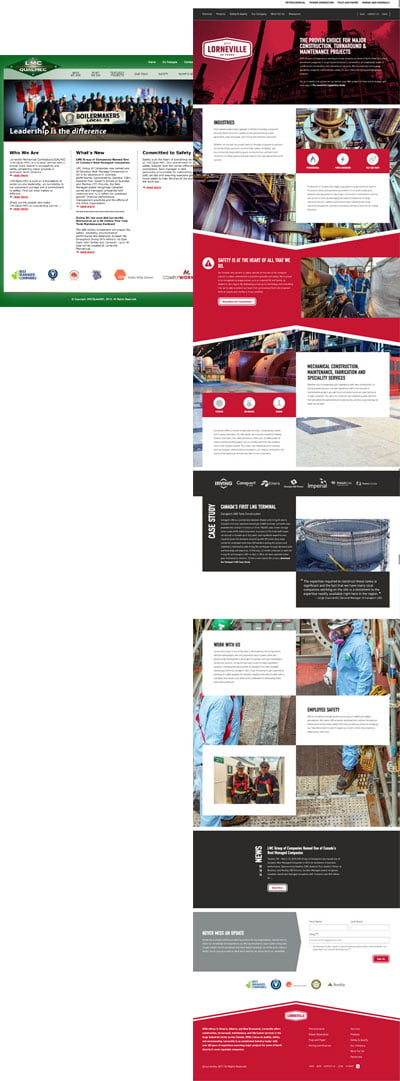
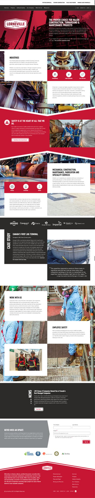
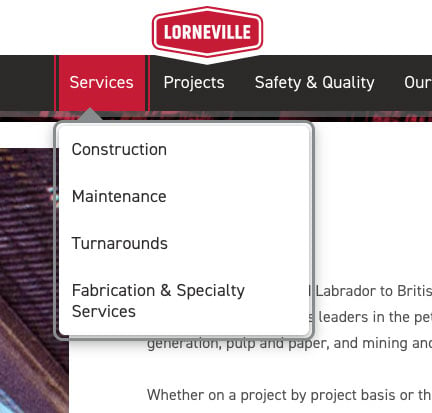 A screenshot of the navigation on Lorneville’s website
URLs As Navigational Aide
An oft-overlooked form of navigation is the URL structure. The use of a consistent structure not only helps with SEO, but can also provide power users a way of navigating to site content directly. We call proper URL structure ‘speaking URLs’, meaning that it’s very easy to give the direct link to a page over the phone. It doesn’t really matter if you use capitalization in URLs, just do it consistently—it may be easiest to stick to lowercase characters. Instead of spaces, the WordPress default method of using the dash in a URL works well and is easy to read.
One last tip: a properly designed website navigation system should mean that the user never needs to use the browser’s Back button, but it doesn’t mean that your site can afford to break the way the Back button works. Don’t let your agency get cute with default browser functionality such as the Back button or custom scrolling behaviour. In every case, it detracts from the site’s usability and expected functionality.
Accessibility
Experts estimate that in the United States alone, more than two percent of internet users have a visual disability. Fully blind users may use Braille and screen reader technology which benefits from front end code that is semantic and well-structured. Many users with low vision may use traditional browsers with assistive technology, meaning that the design must be legible and readable even if the user has only a portion of their vision.
True website accessibility goes well beyond good code practices. In fact, numerous governments—including those in Canada and the US—have adopted the W3C’s recommendations in the form of the Web Content Accessibility Guidelines (WCAG). These are a series of rules for everything from typographic usage, to code structure, navigation, and visual guidelines for contrast and design.
A good web development firm will be aware of the laws in your jurisdiction and will work with you to ensure that your site is compliant. More in-depth audits are available to ensure that websites and other online systems do not leave you open for a costly discrimination lawsuit. Well-thought-out accessible sites are easier to use for everyone, and it’s just good business.
Get the Manufacturer Website Accessibility Checklist
This checklist will help you to gauge your site’s level of accessibility and show you how to fix the most common issues facing manufacturers. Get the Manufacturer Website Accessibility Checklist:

Typography
Gone are the days when web designers had only two fonts to work with online. Font serving technology is now either inexpensive or free, giving you access to massive libraries of classic and modern typefaces. This means that you can now move beyond Helvetica or Verdana and actually use a licensed font from Adobe, Google, or many other small independent foundries. Of course, with great typographical power comes great responsibility, and restraint must still be exercised. Add too many fonts or weights to your page, and you risk a dramatic increase in the download time for the site and a ransom-note-like appearance. Classic rules of good typography still apply, so try to stick with just two typefaces, and use scale and color to increase contrast and enhance readability.
Don’t forget to test on all common browsers and devices to ensure that the type remains legible at all sizes. Just because we have screens with near print-quality resolution doesn’t mean that 6 point Caslon is a good choice for reading extended text on a retina phone screen.
Lastly, ensure that if your custom brand-matched typefaces fail to load, the fallback still looks good and provides a usable and intelligent hierarchy of information.
 An example of a typeface supported by modern browsers and devices
HTML and CSS
While it may look like gibberish to the average marketer, the underlying structure of all web pages is made up of two core technologies which complement each other. The first, HyperText Markup Language (HTML) is what’s used to structure the content itself. HTML is written by forming ‘tags’ around each element on the page as well as within the overall page structure.
Within HTML, there should be absolutely nothing describing the ‘look’ of the page. The job of styling and laying out the content is left to Cascading Style Sheets (CSS). This helps to separate style from content and ensures that screen readers aren’t impeded by font or colour tags throughout the HTML. Most modern web teams also use CSS systems like Sass or LESS, enabling them to write compact and complex styling systems that have better hierarchy and download faster once they have been compiled.
Years ago, the web designers with the Web Standards movement fought with browser makers to get them to interpret HTML and CSS in consistent ways, instead of having different versions of HTML for every single browser. In the process, we also opened the door for more accessible sites and responsive design technology. While it’s less of a concern today than ever before, it’s still important to ensure that your agency understands the importance of writing clean, accessible markup. Beyond accessibility, well-crafted front end code helps websites rank higher in search engines, renders faster, and is easier to maintain.
Website Management
Way back in 1996, the agency I was working for received a Request For Proposal that required a website which needed to be managed via a web-based interface. At the time, the idea of a content management system (CMS) was akin to the craziest kind of voodoo, and we weren’t even sure it was possible. Every page on a website needed to be coded by hand and carefully maintained by web professionals. In the intervening years, content management systems became the norm rather than the exception, and now anyone can create a fully database-driven website with the click of a button.
Other than the differences between closed and open source toolsets (essentially software that is either paid vs free) the biggest contrast is between hosted systems like the HubSpot COS and systems you can host on your own server such as WordPress.
WordPress: the world’s most common CMS
WordPress has grown from an easy to use, ultra-simple blogging platform to the dominant player in the CMS space with well over 74 million sites running on it. WP is incredibly capable, but still relatively easy to use. A strong development team will be able to use WordPress to create complex data-driven sites while also integrating outside tools such as marketing automation platforms or ecommerce.
Most companies are only interested in the parts of the back end that they will need to use on a regular basis. The Wordpress content editor is a simple affair, making it easy to set the hierarchy of the content, add images or other rich media, and organize the page within the overall site architecture. It’s easy to link to other content pages or external resources, and plugins such as Yoast help marketers fine-tune title tags and meta descriptions for each unique piece of content.
The plugin dilemma
WordPress plugins are a big part of the platform’s attraction. If a certain piece of functionality isn’t available within the core architecture, chances are that there are a few options available that are either paid or free. A word of caution, however: not all plugins are created equally, and it’s important to choose options that have good ratings and support behind them, so that security fixes are provided in a timely manner. Be aware as well that adding too many plugins to your WordPress site can slow it down, or create conflicts within the back end of the site. This is why it’s essential to have a competent development team that can work with you to achieve the desired functionality while still maintaining the performance of your site.
WordPress security
WordPress is to other content management systems as Windows once was to desktop operating systems. It’s the 800 pound gorilla in the room and, as such, it is an appealing target for hackers. This means that it’s absolutely essential to keep your WordPress installation up to date as security patches come out. A hacked, outdated version of WordPress can rapidly turn into a headless bot site, ruining your online reputation, SEO, and email deliverability. Make sure your development team has a few hours every quarter set aside to maintain and keep your site up to date, or risk being marked on the Google search results page as a ‘hacked site’—a surefire way to kill potential traffic and leads.
Despite all of this, WordPress remains one of the best content management platforms in the world. It’s fast, easy to manage, and truly extensible. Plus, many young marketers have experience with the system, meaning that the learning curve for your team is likely small.
HubSpot COS
In 2014, HubSpot released the latest version of their content management system, the COS (Content Optimization System). Designed almost entirely for content marketers, the COS has features that few other systems do. A COS-driven site can tell who is on the site and whether or not they are already in your lead database. Based on any criteria in the contact record of that visitor, it’s possible to serve different content or calls to action. For example, someone who has already made a purchase from you has different requirements from your site than a visitor who has only just found you in a Google search. The same goes for a visitor who has already downloaded one of your top of funnel guides. There’s no need to show them the same guide offer again—it makes more sense to provide them with a link to a mid-funnel asset such as a case study.
This focus on optimizing the contextual experience of your site visitor makes the COS an excellent choice for marketers without major development requirements. WordPress integrates better with other tools since it is self-hosted, and there’s more that can be done to customize the platform. This means that if you’re planning to integrate with custom data, run an ecommerce platform that integrates with your CMS, or anything else of a particularly custom nature, the COS may not be the most extensible choice.
If, however, your core concern from your content management platform is serving appropriate content to the right people at the right time, the COS is a game changer. The Kula dev team has developed some custom WordPress tools that give contextual marketers some of the power of the COS when integrated with HubSpot’s marketing automation features.
Other content management platforms
There are hundreds of other content management systems available, from open source juggernauts like Drupal to insanely expensive closed source platforms like Ektron or Red Dot. In our experience, huge enterprise class systems make sense for almost no one. They are difficult to extend, have very little custom development support, massive ongoing costs with next to no benefit, and few agencies or firms can help with integration.
In the past few years, a number of small-business class hosted, closed source systems have come online, such as SquareSpace. These tools have a modest fee to use and a fairly limited feature set and templating system. They are, however, a great way to quickly stand up a good looking and easy-to-manage site. Just don’t expect to be able to easily customize everything in the site.
For many advanced digital marketers, the ability to quickly integrate new tools, enable ecommerce, and perform digital marketing means that they should stick with the most well-known platforms like WordPress or HubSpot COS. The choice generally comes down to what you want your website to do for you. If it’s a more complex, integrated suite of ecommerce applications, WordPress is likely a better fit. If your entire site is about moving visitors through a sales funnel, the COS will give you power that you can only dream of with other tools.
Custom Development & Integrations
Further to the previous section on content management systems, more development-intensive tasks may be required in your marketing mix, so it’s important to choose a platform that supports your efforts.
Interactive Calculators
Custom interactive calculators have become more and more commonplace in digital marketing programs, especially for manufacturers who have complex product systems, that can be made easier to understand with a custom solutions finder. Kula was one of the first agencies to implement these custom offers and integrate them with HubSpot. We have found that interactive offers convert at more than twice the rate of traditional static offers such as eBooks. Potential customers find them highly valuable since they can customize the results to their own unique situation. While cost calculators are the most common format for interactive offers, it’s also possible to develop things like:
- Product selectors
- ROI calculators
- Cost savings calculators
- Solutions finders
- Quizzes and surveys
This is just the start of what can be done with a simple interactive form. The key with these assets is to ensure that all of the lead’s contact details are stored in your marketing automation platform database before giving access to the calculator. Once you have saved the contact details, your developer can use asynchronous data techniques to send valuable data to the contact record, saving the lead’s preferences, product selections, budget, and more. This data can be incredibly useful for sales teams who are looking to gather as much information as possible about their prospects.
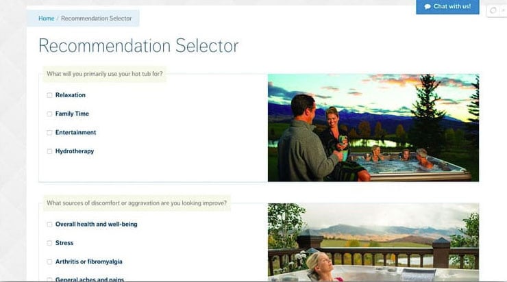 Example of an interactive product selector, which takes users’ inputs and provides a corresponding product at the end
Ecommerce
For many manufacturers, selling directly to customers via ecommerce is a massive opportunity to eliminate the middleman and go directly to product buyers. For others, it’s an opportunity to simplify payment and billing for smaller orders that would otherwise be difficult to process through traditional purchasing channels.
There are as many ecommerce systems available as CMS platforms, and their levels of complexity are just as varied. As with content management systems, the biggest difference is between hosted systems such as Shopify and BigCommerce and stores you can run on your own web server like Magento or WooCommerce.
Hosted platforms provide everything you need to run a successful store. You simply customize the design (or choose one of their templates), set up shipping and tax tables, upload your products, and open the store. Tools like Shopify have a monthly fee and take a percentage of each sale on top of the regular credit card processing fees you’re going to pay. These systems are best for simple stores that do not require any sort of custom integration or complex products that require configuration. The best hosted ecommerce platforms also have either native or third party integration plugins to send customer data to your marketing automation platform, so that you can create custom workflows to handle abandoned cart nurturing, time-based reordering, and other tasks.
Hosted ecommerce sites running on tools such as Magento or the WordPress add-on WooCommerce, on the other hand, allow for much tighter integration and customization with your core web platform. They also often have the ability to create deeper connections with your marketing automation system. When using a tool like WooCommerce and WordPress, the line between site content pages and store pages can be blurred, allowing you to easily combine product listings, blog posts, product landing pages, and more with a greater level of integration.
Ultimately, you should choose the platform that best suits your requirements and integrates most tightly with the CMS and digital marketing tools you’re using. Having your agency team go through a Foundation Phase as mentioned earlier in this guide will allow you to determine the best technical architecture for your needs before you get too deep into the Build Phase.
CRM Integration
Enabling closed loop analytics is one of the most important aspects of digital marketing. Knowing how customers found you, what content they consumed before making a purchase, and ultimately what caused them to buy is essential intelligence for modern sales and marketing teams. Many companies come to our agency with a legacy CMS that is industry-specific, with limited ability to integrate with a web-based inbound system like HubSpot. Others have a history of using cloud-based tools like Salesforce.
Most legacy CRMs have poor capabilities when it comes to integrating with cloud automation platforms. They often run on some antiquated server housed in the bowels of the company’s headquarters and can’t connect via modern protocols such as REST or other APIs, making integration a rather manual affair. Other legacy CRMs can be setup using a tool like Zapier to send data up or down (but often not both) to HubSpot.
Salesforce is the exact opposite. The leader in online CRM integrates beautifully with most marketing platforms, but the biggest issue is that the customization options are so plentiful that it pays to have an expert at the wheel to perform the initial setup and ensure that all appropriate notifications are also created and tested. Salesforce also integrates very nicely with upstart CRM products such as the HubSpot Sales suite.
No matter what CRM platform you’re currently using or planning to implement, it’s always a good idea to investigate integration capabilities before selecting a partner and platform.
Other Integrations
As with CRMs, ecommerce, and other tools, there’s a good chance that any tools you’re using online (such as invoicing software or prospecting tools) have some form of integration with your marketing automation platform. A good agency will work with you to find the right integration solution, or help you migrate contacts and content from your existing tools to more modern software. This is especially important as it applies to the legacy ERP back office systems that many manufacturers utilize.
On-site Search Engine Optimization
The first step to ensuring that your site ranks well in organic search happens at the content and code level. While true organic search domination requires a great deal of additional work—including link building, ongoing keyword-targeted content planning, and more—establishing a solid foundation during the site build phase will make your job easier and help the site climb the ranks.
The Content Audit
Starting during the Content Audit, you and your agency will define important and strategic keywords and phrases that are worth winning. These keywords help form the basis of your page names, URLs, and titles. Working with your agency, ensure that content is written in a way that uses the keywords organically throughout the body copy and focuses heavily on these terms in the main headline and title tag. As content is implemented in the site, use subheadings to draw attention to each section of the page and use the keywords within navigation and other site links.
Site structure and linking
Ensure that your agency understands the importance of proper site structure, placing the most important site pages high up in the site navigation hierarchy and using speakable URLs which also include keywords. The underlying HTML should be clean and semantic, with each tag adding meaning to the content it surrounds. Tell site visitors and search engines what each page is about in the main headline, and make absolutely certain that there is only one <h1> tag on each page.
Provide links within the content throughout the site so that users can move laterally from page to page with ease. Google and other search engines will also crawl these links, so use anchor text that is relevant to the content you’re linking to, avoiding generic language such as ‘click here’.
Image optimization
Every image on the site with any value whatsoever should have a descriptive alt tag that says what is contained in that image. Images should also be descriptively named. ‘2013-Ford-Focus-ST-Front.jpg’ is much better than ‘car.jpg’ or (even worse) ‘image001. jpg’. Not only does this help users who are visiting the site with assistive technology better understand your non-text content, it tells search engines what the image contains and can help greatly with image-based SEO. It’s often easier to rank for difficult keywords with images than in the regular organic results.
Sitemaps and 301 redirects
Ask your web developer if they have created a dynamic XML sitemap and submitted this to Google’s Search Console (formerly Webmaster Tools). This document should mirror your information architecture and update itself every time a new page is created, signalling to Google that there is new content to index.
Since this guide deals primarily with website redevelopments, if you’ve needed to change the URL structure from the previous site, it’s absolutely essential that your web developer has configured 301 redirects for every URL that has changed. A good developer will use an analytics package to determine what pages are receiving site traffic and create a plan for mapping old URLs to the content’s new permanent location. That way, even if someone lands on an ‘old’ page, they’ll end up at the current updated location. This task should be completed just before the new site launches.
Most agencies worth their salt perform these tasks by default as they prepare to launch a site, but it’s important for marketers to have a sense of what’s happening under the hood before a site launches and ensure that all possible steps have been taken to mitigate any sort of new site traffic dip.
Launching Your New Site
Before you push your new site live, it’s important to configure and implement all of your analytics packages including (but not limited to):
- Visitor analytics such as Google Analytics
- Tracking tools for Google Ads and other pay per click advertising (within the site and in your Analytics package)
- Digital marketing/automation tracking such as HubSpot
- Heatmap and click map tracking such as VWO or Optimizely
Keep in mind that each of these tools can impact your site speed and performance, but establishing a baseline for performance with the new site will be key to iterating on the design and content once it’s all up and running.
The all-important site review
Once the site has been coded and all content has been integrated, take some time to visit and read every page within the site. While your agency will have taken great care to test every piece of functionality, software and websites are built by humans and things can slip through the cracks—especially on a large website. When you’re 100% happy, your agency will ask for written approval before moving the site from a staging environment to the production server.
Site migration
When the development team has received written sign off, they will begin the process of migrating the site. Modern agencies that follow best practice software development methodologies will be using a repository such as GIT (if the site is built in WordPress or another self-hosted technology). Using this tool, all approved files will be ported to the live server environment. Databases will be copied into place and all security measures will be put in place around passwords and other access elements. If using a system like the HubSpot COS, files will be copied from one area of the site to the live environment.
As noted earlier, it’s at this moment that the dev team will implement the 301 redirects and upload the XML sitemap to Google Search Console.
If your previous site and new site are housed on the same server, you’re ready to go at this point. If not, it’s now time to make modifications to your DNS server entries to point your URL to the new environment. Depending on the type of change this could happen immediately, or it may take 24 hours or more to propagate. When everything is live and visible to the world, take one last opportunity to review everything, then bask in the glory of your new site. Tell your friends. Tweet it. Have a party with special hats.
The last step to take once the site is live is to enable caching, or a content delivery network such as Cloudflare, to further optimize its performance. Anything you can do to speed it up will help with SEO and conversion.
Redesigning an International Website? Watch This Webinar
For international manufacturers, there's plenty more to consider when launching a new website. In this webinar, Kula Partners Principal Jeff White outlines 20 actionable considerations for creating an international manufacturing website that stands out from the competition online. Watch the on-demand webinar now:

Ongoing Improvement
So your new site is live. The good news is that you have a great new site that better represents your brand and conforms to modern site standards. The better news is that you now have an opportunity to use your improved site to further enhance conversion and search rank.
Use the heatmaps and analytics that have been implemented to develop an understanding of how people are moving through the site, and see how they are converting. As soon as you have a baseline, you’ll be able to see where improvements can be made. Create a hypothesis and begin to split test different ideas to improve conversion. You can use Hotjar or other CRO tools to implement and run these split or A/B tests. Your hypothesis may be as simple as changing a button colour to see if it draws more clicks and attention, or it may be as complex as redesigning an entire page to see if it performs better than the control. Once a statistically significant result has been achieved, it’s time to make another bet and continue to try to improve the results incrementally over time.
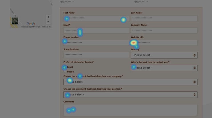 A screenshot of how heat map results appear overlaid on a website, with the red indicating areas of highest engagement
If you’ve followed our advice on reusing as much of your content as possible to get the new site up and running quickly, it’s now time to concentrate on improving what’s already there. Select the most important pages and write fresh, updated content. This can also be split tested for improved conversion, or you can simply implement it to try to gain additional search rank.
Using the Digital Marketing Strategy created during the Foundation Phase, begin producing fresh blog and social content, and use the tactics described therein to drive more traffic into the top of the funnel.
As we’ve stressed throughout this guide, the important thing is recognizing that the new site is a launchpad for additional growth—but significant growth won’t happen without ongoing data-driven iteration.
Get In Touch For Expert Help With Your Website Redesign
In some ways, redesigning a website is now easier than any time in recent history. The tools and techniques that are available work better than ever, and make it much simpler to determine what’s working and what isn’t. There’s a wealth of data available to marketers about their own sites, showing how visitors arrive, convert, or drop off.
At the end of the day, a website redesign project is an opportunity to realign your site design, content, and structure to match a modern web user’s expectations and help an organization meet their traffic and conversion targets. Recognizing that the new site is just the starting point for great results and not the finish line is the key to success.
If you’re ready to start the process of a website redesign project, please get in touch or book a meeting with Kula Partners.